Expressive fashion, considered shopping and a route to customisation.
A design decision, in context
Why customisation belonged in the shopping experience.
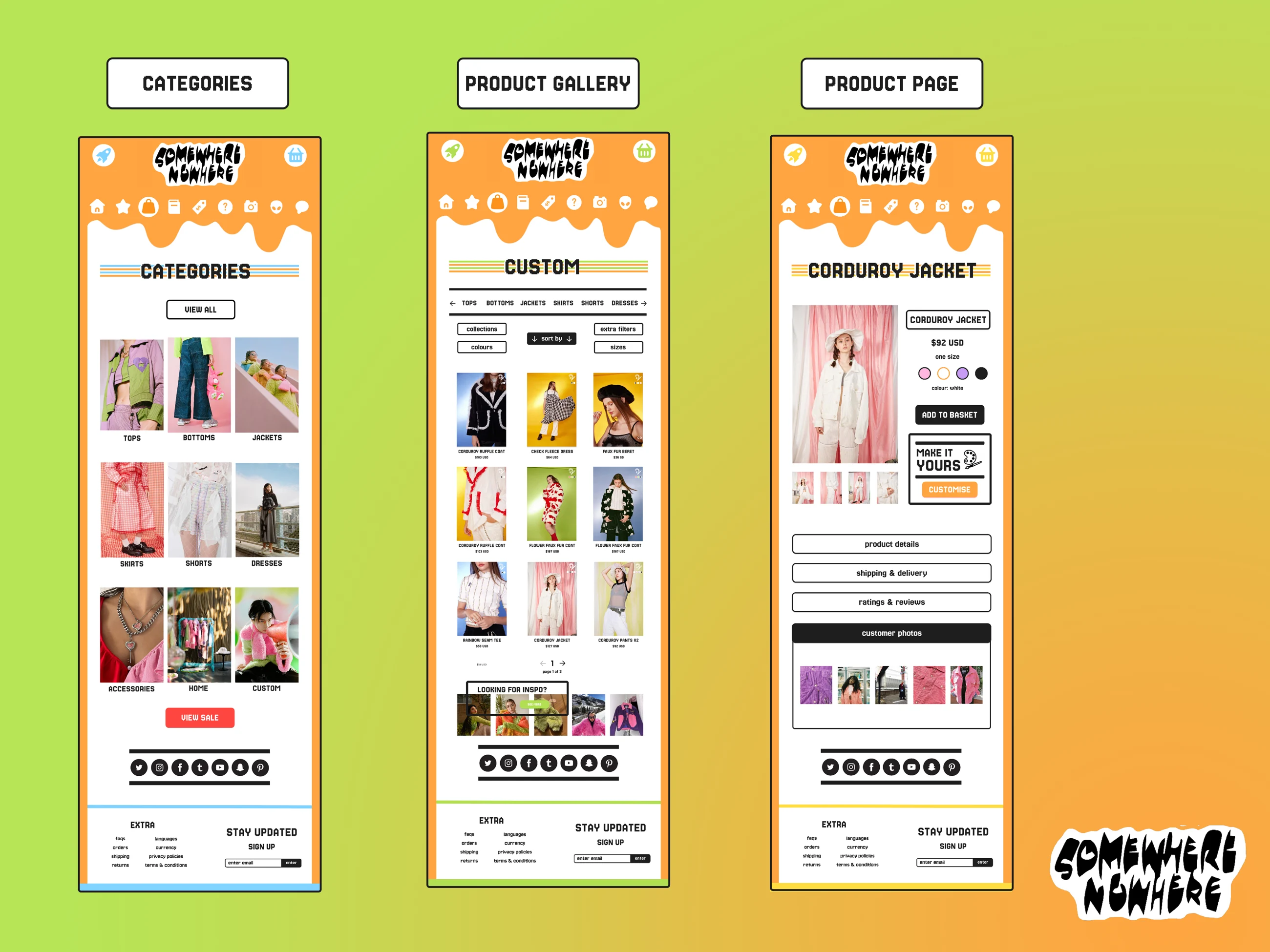
Original page designs: category, gallery and product.
The evidence
In my exploratory survey, 7 of 18 respondents preferred customisation or personalisation as a new store feature; 6 preferred technology features. Customisation led by one vote, so the survey informed the direction without establishing a clear consensus.
The design judgement
I combined that preference with the brand’s handmade, experimental character. I chose a “Made for you” direction over more ambitious retail technology, considering what could fit a smaller product range. Creations gives that direction a visible place alongside the shopping pages.
Project overview.
An independent, uncommissioned ecommerce redesign exploring how Somewhere Nowhere’s playful identity could support product discovery and a more personal relationship with clothing.
Brand and competitor research · Exploratory survey · Ecommerce UX/UI
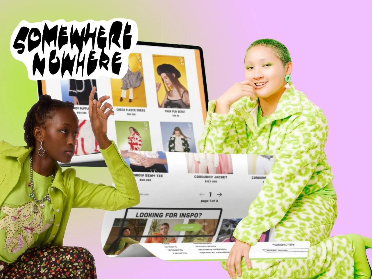
Website concept by Rhi. Brand photography and clothing are used as visual context; this device mockup presents the design.
01 / Research and direction
From preference to a design choice.
I reviewed the existing website, brand identity and competitors. My assessment was that the restrained site did not fully reflect the clothing’s playful character. I also created a 15-question SurveyMonkey survey, shared through my own social media. Its 18 responses offered exploratory preferences, rather than a representative sample of the brand’s customers.
In a separate question allowing three selections, 15 respondents chose unique, one-off products and 14 chose the ability to customise. Together with the brand research, this supported exploring participation and personalisation. These responses did not test the proposed interface.
02 / Shopping decisions
Give expressive pages a clear shopping structure.
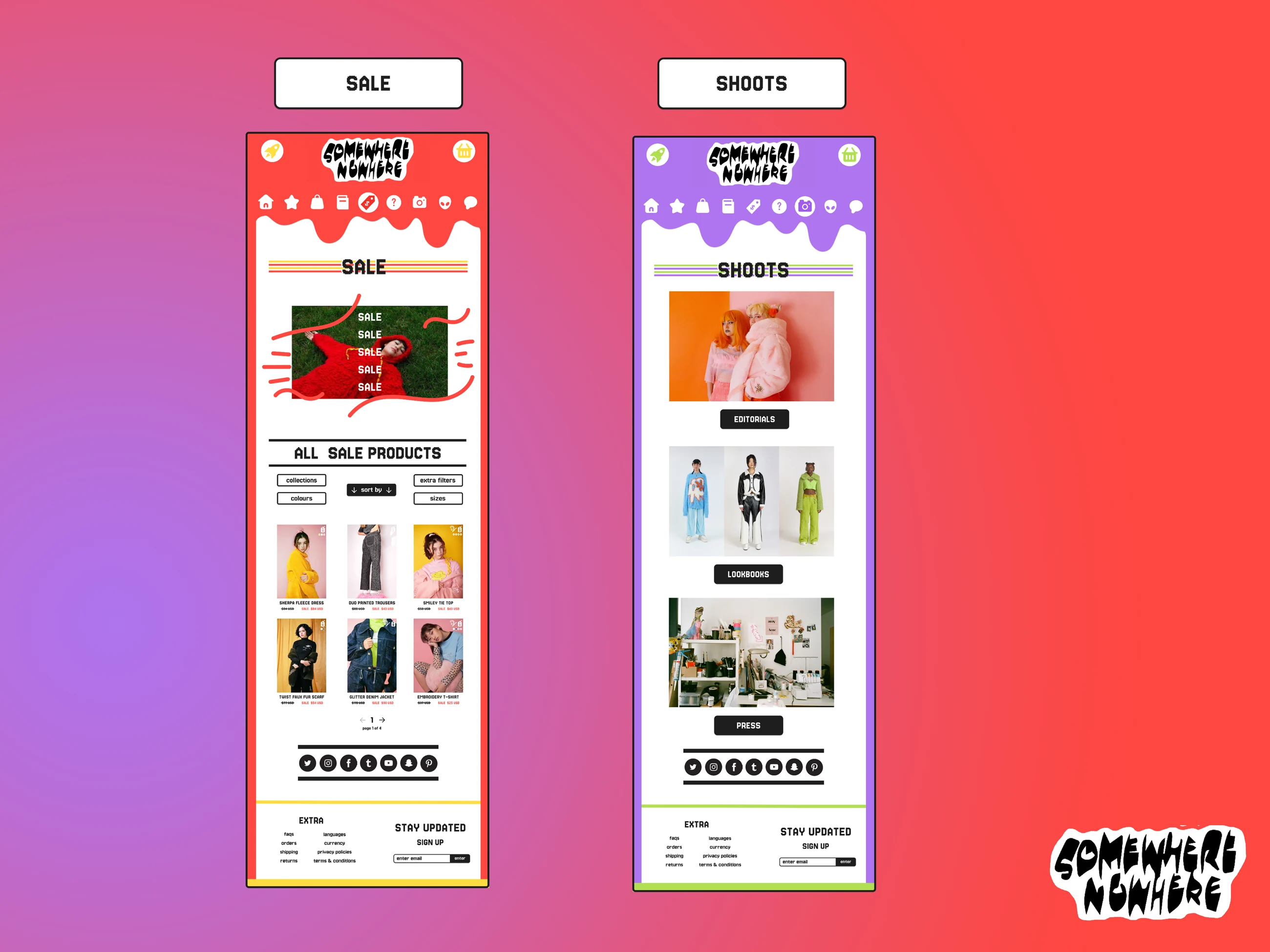
The page designs combine bold colour and brand imagery with category browsing, repeated filtering controls and product information. The intent is to help shoppers move from an expressive first impression to a more informed product choice.
The product page brings imagery, price, size and colour choices together, with expandable details, shipping information, reviews and customer photos. The planning document also maps a basket pop-up and payment flow; these are proposed interactions, with no completed usability test evidenced in the supplied work.
03 / Participation
Turn “Made for you” into service entry points.
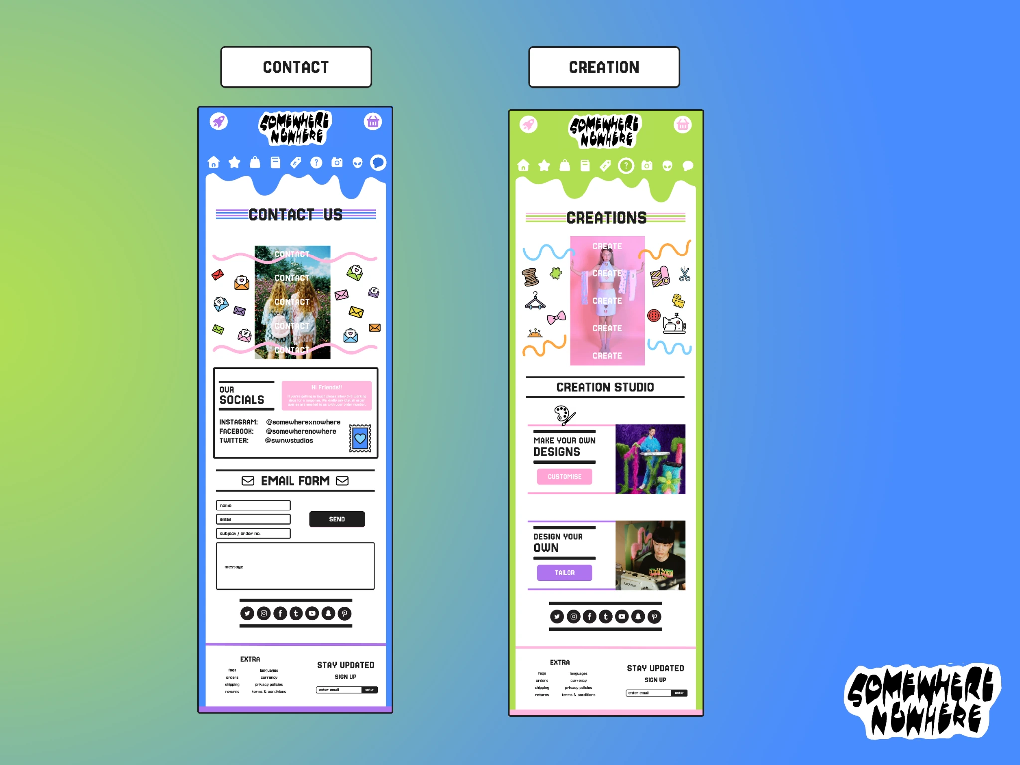
Creations brings Custom and Tailor into a dedicated area. Custom explores choices such as colours, materials and extras. Tailor proposes a more individual request using measurements, reference images and supplied materials.
The wider proposal also explores DIY videos and community participation. The page shown below is the Creations entry design; it does not establish that these services were implemented or operated by the brand.
04 / Next validation
Test clarity as well as character.
The next validation priorities are whether shoppers understand the icon navigation, can find and compare products, and can distinguish customisation from adding a standard item to the basket.
The proposed Enter splash screen adds a step before shopping, while light icons on coloured backgrounds need contrast checks. Task-based testing would help assess those trade-offs. The project demonstrates research, direction-setting and interface design; there is no measured conversion or usability outcome.
The interface designs.
Open each original page group for a larger view. These are concept layouts; brand photography and clothing are reference material.
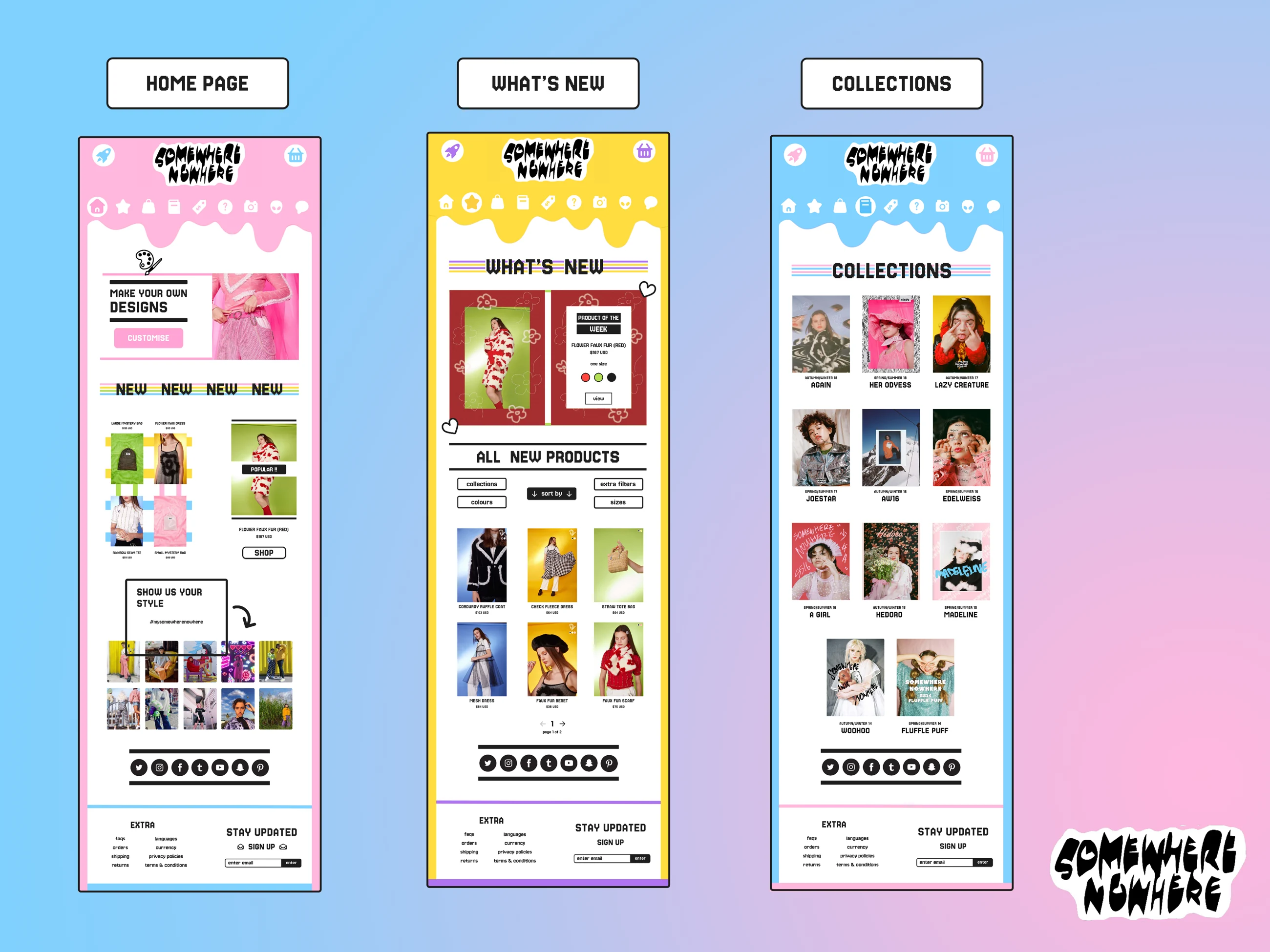
Categories and product detail. Category browsing, product imagery and purchasing information in the proposed interface.Creations and contact. Custom and Tailor entry points in the Creations design, shown alongside the contact page.Home, new arrivals and collections. Brand expression alongside collection discovery and product filtering.Sale and shoots. Sale browsing and editorial photography within the same visual system.